|
|
Post by BlueAndGold on Dec 29, 2019 23:13:21 GMT
This is my proposed cover for an inexpensive small collection of poems and photographs - only about 36 pages, so no spine text. Shred away, please!  Click on the image for a bigger view. |
|
|
|
Post by Retread-Retired-Cameron on Dec 30, 2019 12:16:03 GMT
My guess is the Rockies.
On the title color, that shade of yellow doesn't quite do it for me. Maybe a darker shade that contrasts more with the background?
|
|
|
|
Post by ronmiller on Dec 30, 2019 13:20:38 GMT
I think that the cover is a little bland and uninvolving. It's really a lot of very empty space. The title (and back cover blurb) only describe the nature of the contents---poems---but nothing of what these poems and photos might be about. Is there any sort of connecting theme? Or are they about a wide variety of topics? In either case, I might choose an image that is a little more attractive visually. What you might want to look for is an image that has a dominant subject. In the present image, there really is no central subject. Everything is pretty much of equal interest...the result being that there is no focus for the eye, nothing to attract it.
The title could be larger and with less space between "14" and "Fourteeners" so that it reads as a phrase. You may also want to consider having "Fourteen" in all caps.
|
|
Deleted
Deleted Member
Posts: 0
|
Post by Deleted on Dec 30, 2019 14:44:43 GMT
Blue, don't do it. Background is not bad. Change font, change font colours, increase size. Use a book you like on Amazon as a guide. Look at this one; it's just poetry and images and is a bestseller and has over 2000 reviews: 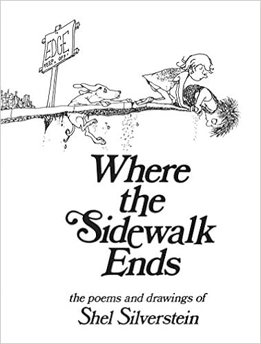 |
|
|
|
Post by ronmiller on Dec 30, 2019 14:57:44 GMT
A brilliant example, Maggie!
|
|
|
|
Post by ronmiller on Dec 30, 2019 15:06:33 GMT
I think you might want to also rethink the title and description. I am not so sure that anyone is going to really want to buy a book simply because it contains poetry or (more specifically) poems that rhyme. I think that someone might be more interested in what the poetry is about, what its themes or ideas may be. I think you might want to consider getting something of that across in either the title, the description or both. About the only sort of author who can get away with a title like "Ten Stories" or "Twenty Poems" would be someone with a well-known name, in which case the potential reader would have some notion what to expect.
In the example that Maggie posted, even though Silverstein was a very famous author/cartoonist at the time this book came out, he still made sure that he had an evocative, attractive, interesting cover.
|
|
|
|
Post by BlueAndGold on Dec 30, 2019 15:42:54 GMT
Thank you! All input appreciated!  The term "Fourteeners" is a little play on words. In my local area its common useage is to refer to mountains over 14,000 feet high, of which there are many. The less common useage is to refer to 14-syllable-per-line verse. The little book contains 14 such poems, though there is no general theme other than to introduce the reader to the form. So I thought the cover might be a pastoral scene including mountains which might entice locals or visitors. The next little project will be significantly larger, including varied forms, and will indeed have a theme. I already have an idea in mind for it thanks to your advise, Ron! It's a few weeks out I think. Sphinx! You're right. The yellow bugs me too. A deeper orange shade and all capitals might work better. Maggie! That example is great! It makes me want to look inside! It totally works! Sighhh... |
|
|
|
Post by ronmiller on Dec 30, 2019 15:57:42 GMT
Thank you! All input appreciated! The term "Fourteeners" is a little play on words. In my local area its common useage is to refer to mountains over 14,000 feet high, of which there are many. The less common useage is to refer to 14-syllable-per-line verse. The little book contains 14 such poems, though there is no general theme other than to introduce the reader to the form. So I thought the cover might be a pastoral scene including mountains which might entice locals or visitors. The next little project will be significantly larger, including varied forms, and will indeed have a theme. I already have an idea in mind for it thanks to your advise, Ron! It's a few weeks out I think. Sphinx! You're right. The yellow bugs me too. A deeper orange shade and all capitals might work better. Maggie! That example is great! It makes me want to look inside! It totally works! Sighhh... Well, you may have underscored part of the problem with your title. Local usage of a phrase means that there will be only a limited number of people who will understand your play on words...and combining this with an even less common usage only exacerbates the problem. If, indeed, your book is meant strictly for locals and visitors, your cover might be acceptable (even if the title might puzzle an outsider)...but by the same token I don't see any special reason to limit your book's availability. And if your poems don't actually have much to do with the local scenery or local culture, then you may be misleading someone who might be buying your book based on the cover, thinking that the contents relate to the immediate surroundings. |
|
|
|
Post by BlueAndGold on Dec 30, 2019 20:07:55 GMT
I don't think it's disingenuous to use a local photo since it's just a pastoral scene to illicit peace, right? Upon picking up the book or reading the blurb one immediately sees what it's about. But to ease your concern I added a little more text to the blurb on the back. Here's the next iteration, with altered fonts and colors. I think this is some improvement. Maybe?  Click on the image for a more viewable size. |
|
|
|
Post by Retread-Retired-Cameron on Dec 30, 2019 21:20:01 GMT
Okay, now you're getting down to the psychology aspect of your cover, how you want it to relate to the content.
To be honest, the cover makes me want to get out and go yondering over to that horizon. I used to ride, I used to cover ground by foot, and my peaceful contemplation often involves seeing what's over yonder. Hence herding three kids on a two mile hike on what city-folk term a 'challenging' trail. I also like to grow things like stone pines, redwoods, and so on to clear my mind.
Whether on the front, the back, or both, why not mention that the poems are meant to help the reader find a sense of peace, calm, or perhaps restful tranquility? Sometimes you have to be not so subtle with people, but gently steer them toward something but being a bit more direct about what they're getting.
|
|
Deleted
Deleted Member
Posts: 0
|
Post by Deleted on Dec 30, 2019 21:53:50 GMT
I agree with Ron's comment. Make your description your ten-second, universal pitch. It has to be great. Don't assume people won't buy it because it's just poetry and drawings. Your book will be a classic, imagine. It deserves superb. Go wild.
Even if you sound like a fool, pitch, over-pitch, but be truthful. Write poetic, earth-shattering, memorable prose.
|
|
|
|
Post by BlueAndGold on Dec 31, 2019 13:38:03 GMT
Peace, and yondering over the horizon...
I think you hit it, Sphinx.
Back to work...
|
|
Deleted
Deleted Member
Posts: 0
|
Post by Deleted on Jan 3, 2020 9:20:01 GMT
I love Silverstein's cartoons. I've bought his book.
|
|
Deleted
Deleted Member
Posts: 0
|
Post by Deleted on Jan 3, 2020 9:24:32 GMT
Why not mention that the poems are meant to help the reader find a sense of peace, calm, or perhaps restful tranquility? Sometimes you have to be not so subtle with people, but gently steer them toward something but being a bit more direct about what they're getting.
I like that comment Sphinx-Cameron.
PS I had to look up what fourteeners meant. "Colorado has 58 mountain peaks exceeding 14,000 feet (known as "fourteeners" or "14ers" locally) — the most of any state. Outdoor enthusiasts of all skill levels will find peaks ranging from easy to very difficult, with hiking trails for exploring the state's scenery, wildlife and rugged beauty." I'm afraid the title was too subtle for me, but I looked up what 14ers meant because I love poetry. I'll check out the book when it's available.
|
|
|
|
Post by ronmiller on Jan 3, 2020 11:25:24 GMT
I don't think it's disingenuous to use a local photo since it's just a pastoral scene to illicit peace, right? Upon picking up the book or reading the blurb one immediately sees what it's about. But to ease your concern I added a little more text to the blurb on the back. Here's the next iteration, with altered fonts and colors. I think this is some improvement. Maybe? Click on the image for a more viewable size. I don't think this is really very much of an improvement. I think you may be falling into a trap that snares a lot of DIY cover creators: subjectivity. The symbolism of the cover is meaningful to you because, well, you know what it is supposed to mean. And someone should not get their first impression of what a book is about from reading the back cover blurb or leafing through its pages. They have to want to get that far first and that is was the cover is supposed to do: get someone to want to pick up the book in the first place. I don't think that the cover photo does that: it may be intended to evoke peacefulness but may go too far and instead simply be uninteresting. As I mentioned before, the photo really has no central subject. The title, too, which is one of the first things anyone sees, is uninformative. Even if someone gets as far as the subtitle, it really doesn't inform them much as to what the poems are about or what even some of their themes might be. (Larika really underscored a large part of the problem when she said that she had to look up what "fourteeners" meant.) You may want to take a clue from other poetry books/chapbooks and use the title of one of the poems as the title of the book. |
|


